

Color blocking isn’t about wearing every bright shade you can find — it’s about understanding which colors amplify each other and which ones kill your outfit before you leave the house. I learned this the hard way after a disastrous combination of purple and orange that made me look like I was heading to a costume party instead of a client meeting.
The most common mistake I see women make is thinking color blocking means throwing on any two bold colors and calling it intentional. Real color blocking follows rules — specific color relationships that create impact without looking chaotic. When you nail the proportions and pick the right color partnerships, you get that confident, purposeful look that turns heads for all the right reasons.
After years of experimenting with bold combinations and making plenty of mistakes, I’ve discovered that successful color blocking comes down to three things: understanding which colors work together, getting the proportions right, and choosing pieces that let the colors do the talking instead of competing with busy patterns or complicated details.
Styling Tips
Start with complementary colors — these sit opposite each other on the color wheel and create the most striking combinations. Red and green, blue and orange, yellow and purple all create natural tension that catches the eye. I reach for navy and coral constantly because the contrast is bold but never overwhelming.
Use the 60-30-10 rule for balanced color distribution. Your dominant color should cover about 60% of the outfit, your secondary color takes up 30%, and a small pop of accent color fills the remaining 10%. This prevents any single color from overpowering the look and keeps everything proportional.
Choose solid colors over patterns when you’re building a color-blocked outfit. Stripes, florals, and prints compete with your color story and muddy the clean lines that make color blocking work. Save the patterns for accessories or use them as your neutral base with solid color blocks layered on top.
How to Wear Chinos For Women? 15 Best Outfit Ideas
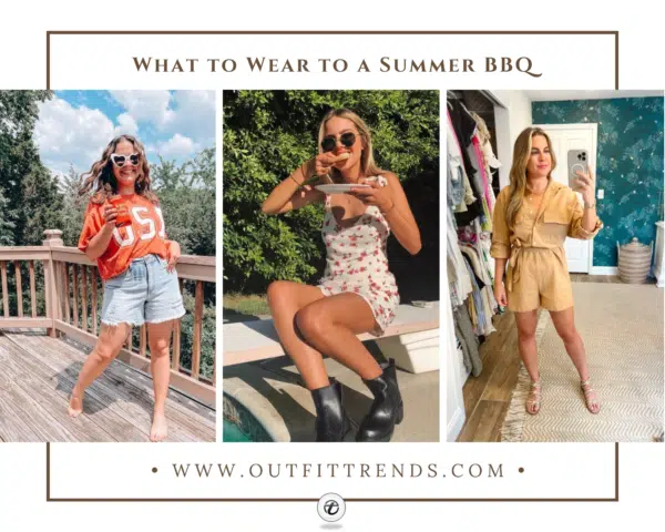
What to Wear to a Summer BBQ? 20 Outfit Ideas for Women
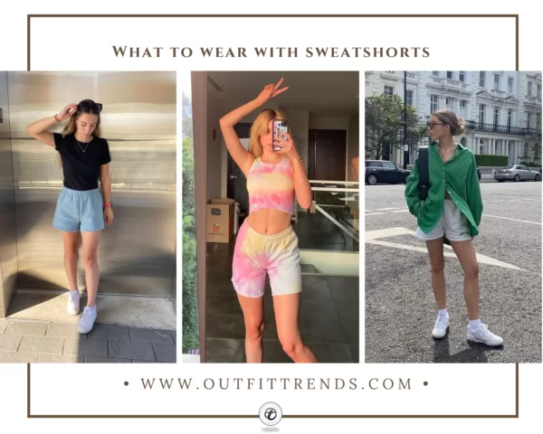
How to Wear Sweatshorts? 21 Best Outfit Ideas for Women

What to Wear Golfing ? 26 Outfit Ideas for Women
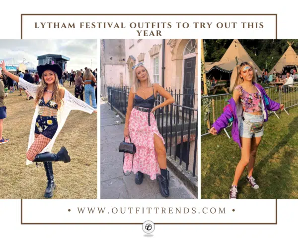
What to Wear at Lytham Festival? 20 Outfit Ideas for Women
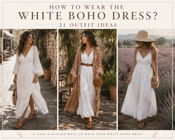
How to Wear the White Boho Dress? 21 Outfit Ideas
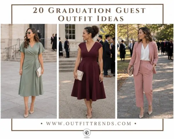
What to Wear to a Graduation Ceremony ? 20 Guest Outfit Ideas
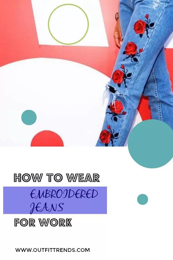
How to Wear Embroidered Jeans? 43 Outfit Ideas
Mind your proportions by balancing where each color sits on your body. If you’re wearing a bright top, pair it with a darker bottom to ground the look. Conversely, a bright skirt or pants works beautifully with a more subdued top that lets the bottom half make the statement.
Color blocking became mainstream fashion in the 1960s when designer Yves Saint Laurent created his famous Mondrian collection inspired by the Dutch painter’s geometric color blocks. The technique was originally used in art to create visual impact through contrast.
Keep accessories minimal because color-blocked outfits are already making a statement. Stick to neutral shoes and bags, or choose accessories in one of your outfit colors to reinforce the palette. Adding a third or fourth color through accessories usually tips the look into chaos territory.
Consider your skin tone when selecting your color palette. Cool undertones look best in jewel tones and colors with blue undertones, while warm undertones shine in colors with yellow or red bases. The wrong color combination can wash you out even if the colors work beautifully together in theory.
Dos & Don’ts
Color Blocking Outfit Ideas That Actually Work
Fuchsia and Orange Power Combo
This bright fuchsia knit paired with burnt orange wide-leg trousers proves that warm-toned color blocking works when you keep the proportions balanced. The oversized sweater tucked into high-waisted pants creates a defined waistline that prevents the bold colors from overwhelming your frame. This combination works best on women who aren’t afraid to make a statement and have the confidence to carry vibrant hues.

Green and Brown Earth Tones
The emerald green turtleneck against chocolate brown leather pants demonstrates how nature-inspired color blocking feels more wearable than primary colors. Adding the camel coat as a neutral bridge piece softens the contrast while maintaining visual interest. This approach works particularly well for women who want to try color blocking but prefer a more grounded, less attention-grabbing palette.
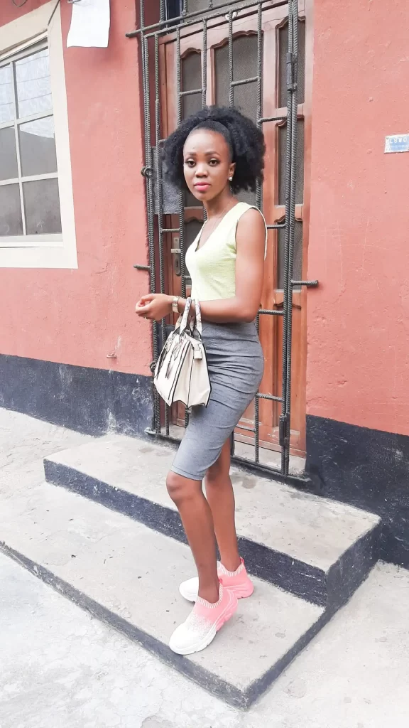
Soft Yellow and Grey Minimal Blocking
This pale yellow tank with grey pencil skirt shows how muted color blocking can feel fresh without being overwhelming. The neutral tones make this combination office-appropriate while still demonstrating intentional color coordination. Perfect for women who work in conservative environments but want to add subtle visual interest to their wardrobe.
Navy Print and Black Evening Block
The geometric navy print skirt paired with a solid black crop top creates pattern and solid blocking that feels modern and party-ready. The high-low hemline adds movement while the contrasting textures keep the look from feeling flat. This works best for evening events where you want to stand out without looking too casual.
Quick tip
Pair neon colors with black basics to make them street-appropriate.
Sky Blue and Orange Professional Blocking
This powder blue shirt with burnt orange wide-leg trousers proves that complementary color blocking can work in professional settings when the pieces are tailored. The crisp shirt fabric and structured trouser silhouette keep the bright combination looking polished rather than playful. Ideal for creative professionals who can push dress code boundaries while maintaining authority.
Light Blue and White Classic Combination
The oversized blue shirt layered over a white tank with jeans demonstrates tonal color blocking that feels effortless and approachable. This combination works because blue and white have such a natural affinity that they barely register as intentional color blocking. Perfect for women who want to ease into the trend without making a bold statement.

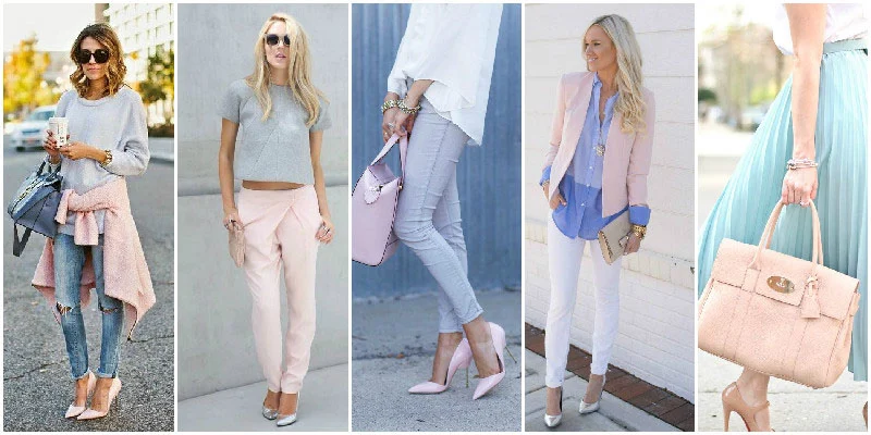
Pastel Multi-Color Blocking
These five looks show how soft pastel blocking creates a cohesive wardrobe approach rather than individual statement pieces. The pink, blue, and grey combinations work because they share similar saturation levels and undertones. This method suits women who prefer a gentler approach to color and want multiple pieces that work together seamlessly.
Quick tip
Use high-waisted bottoms to balance bold color combinations.
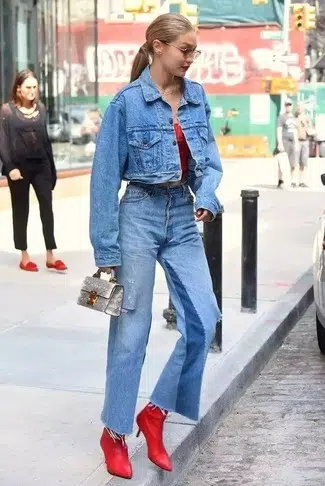
Denim and Red Casual Blocking
The denim-on-denim base with red ankle boots creates accent color blocking that feels approachable for beginners. The red boots become the focal point while the tonal denim provides a neutral foundation that won’t compete. This technique works well for women who want to experiment with color blocking through accessories before committing to bold clothing combinations.
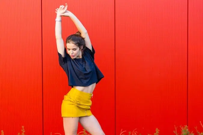
Navy and Yellow High-Contrast Blocking
This navy crop top with bright yellow mini skirt demonstrates high-contrast blocking that creates maximum visual impact. The fitted silhouettes prevent the bold colors from looking juvenile while the short hemline keeps the look youthful and energetic. Best suited for younger women or those with athletic builds who can carry such strong color contrast.
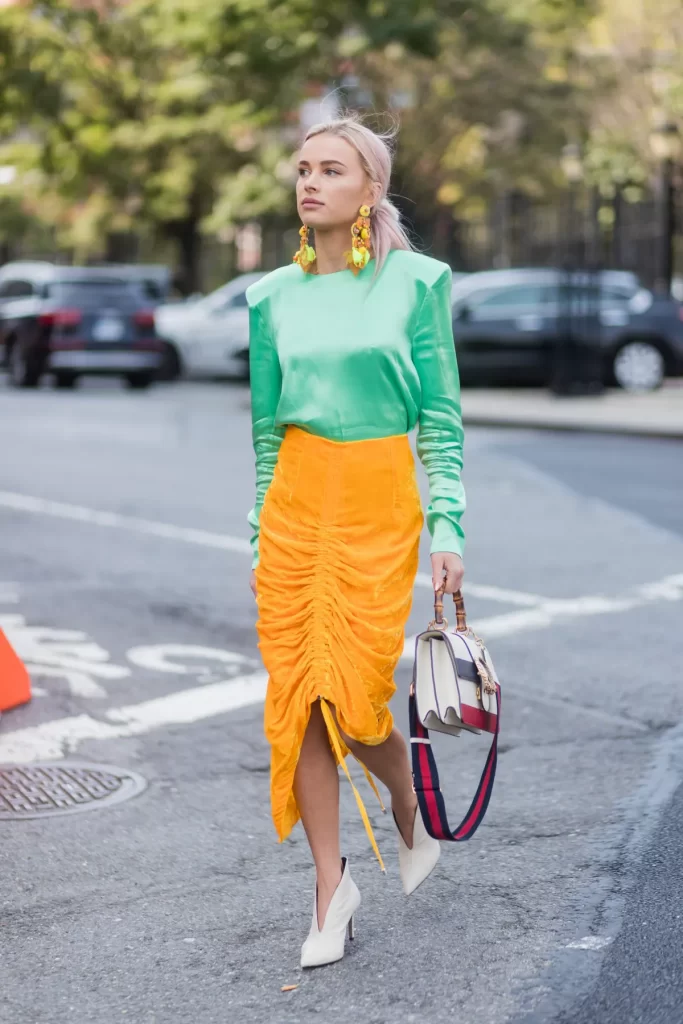
Green and Orange Statement Blocking
The mint green sweatshirt paired with orange ruched skirt shows how unexpected color combinations can work when you balance casual and dressy elements. The relaxed top grounds the dramatic skirt silhouette while the colors create an intentionally bold statement. This look requires confidence and works best for social events where standing out is the goal.
Quick tip
Start with complementary color pairs like blue and orange for natural harmony.
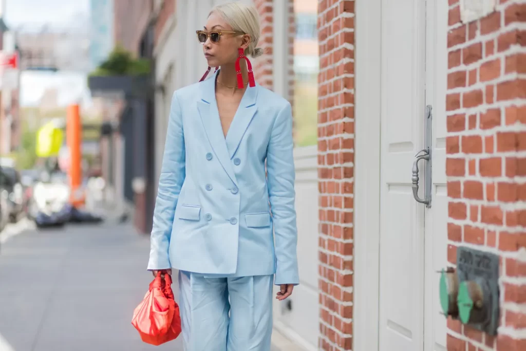
Baby Blue Power Suit with Coral Accessories
This powder blue double-breasted suit paired with a bright coral bag and statement earrings proves that pastels can be just as bold as primaries. The monochromatic base in light blue creates a cohesive foundation, while the coral accessories add warmth without overwhelming the cool-toned palette. I’ve worn similar combinations for important meetings because the soft blue feels approachable while the structured tailoring maintains authority.
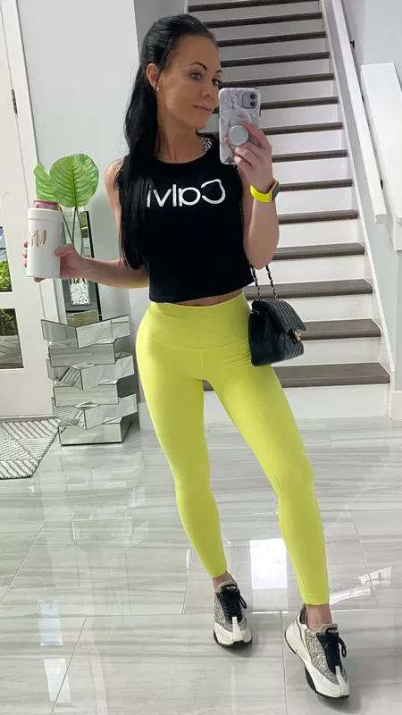
Neon Yellow Leggings with Black Crop Top
This high-impact athletic look demonstrates how to make neon yellow wearable by anchoring it with black. The fitted black crop top grounds the electric yellow leggings, preventing the outfit from looking like workout gear that wandered into the street. The key here is the proportions — the cropped length creates a balanced silhouette that works for casual outings beyond the gym.
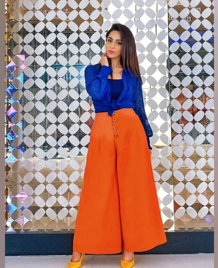
Royal Blue Blouse with Orange Wide-Leg Pants
This complementary color combination of cobalt blue and burnt orange creates maximum visual impact while remaining surprisingly wearable. The high-waisted pants in orange paired with the tucked blue blouse creates a flattering silhouette that balances the bold color choices. I always recommend starting with complementary colors like this when you’re new to color blocking — they’re naturally harmonious even when they feel daring.
Quick tip
Let one piece dominate when mixing multiple bold colors.
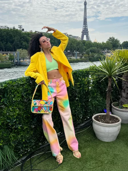
Bright Yellow Blazer with Tie-Dye Pants
This playful combination shows how to mix bold yellow with multicolored prints without looking chaotic. The solid yellow blazer acts as an anchor for the tie-dye pants, while the mint green crop top bridges the two patterns. The trick is ensuring one element dominates — here, the yellow blazer takes center stage while the tie-dye pattern supports rather than competes.
Key takeaways
- Start with complementary colors like blue and orange for foolproof color blocking combinations
- Use one neutral anchor like black or white to ground bright color combinations
- Maintain balanced proportions when wearing multiple bold colors to avoid overwhelming your frame
- Choose solid pieces over patterns when first experimenting with color blocking
- Add small pops of contrast through accessories rather than making every piece a statement
- Keep one dominant color in multi-color outfits to create visual hierarchy
How to Wear Chinos For Women? 15 Best Outfit Ideas
What to Wear to a Summer BBQ? 20 Outfit Ideas for Women
How to Wear Sweatshorts? 21 Best Outfit Ideas for Women
What to Wear Golfing ? 26 Outfit Ideas for Women
What to Wear at Lytham Festival? 20 Outfit Ideas for Women
How to Wear the White Boho Dress? 21 Outfit Ideas
What to Wear to a Graduation Ceremony ? 20 Guest Outfit Ideas
How to Wear Embroidered Jeans? 43 Outfit Ideas


