

The all-black outfit is the safety blanket of monochrome dressing — and the reason most women never venture beyond it. I spent years thinking monochrome meant throwing on black pieces until they matched, completely missing the point that real monochromatic dressing is about playing with texture, proportion, and subtle tonal variations within a single colour family.
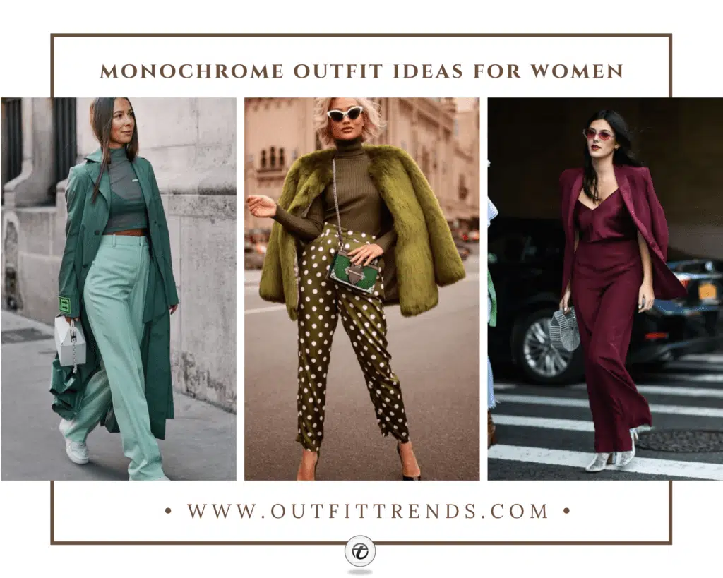
True monochrome isn’t about perfect matching. It’s about creating depth through different shades and finishes of the same colour. The sage green coat with mint trousers works because both sit in the green family but offer contrast through saturation. The burgundy blazer with wine-coloured trousers creates sophistication through tonal layering, not exact colour matching.
How to Wear Monochromatic Outfits?
Mix textures within your colour family
This mint green look demonstrates exactly why texture matters more than perfect colour matching. The knit top, tailored trousers, and structured coat all sit in the green family but each brings a different finish — matte knit, smooth suiting fabric, and wool coating. The visual interest comes from these texture contrasts, not from introducing new colours. Without this variety, monochrome dressing looks flat and one-dimensional.
Coco Chanel popularised monochromatic dressing in the 1920s because she believed matching reduced visual noise and made women look more sophisticated. Her famous beige and navy monochrome looks became the foundation of modern minimalist dressing.
Dos & Don’ts
35 Best Easter Outfit Ideas for Women & Styling Tips
55 Chic Bohemian Outfit Ideas for Women with Styling Tips
13 Chic Spring Work Outfits For Women With Styling Tips
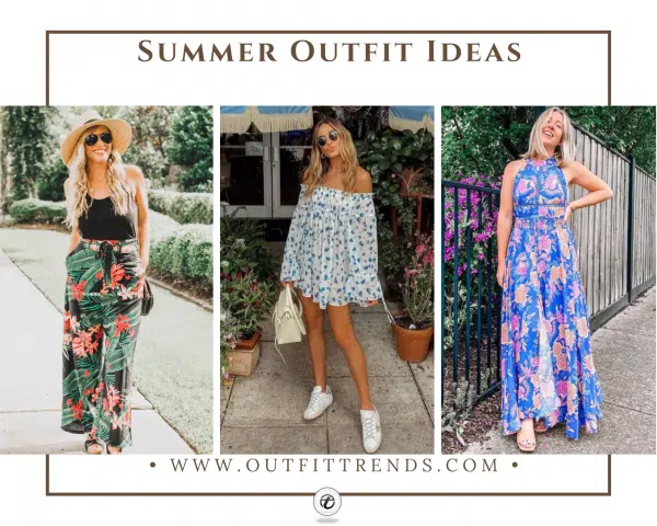
17 Chic Summer Outfit Ideas for Women with Styling Tips
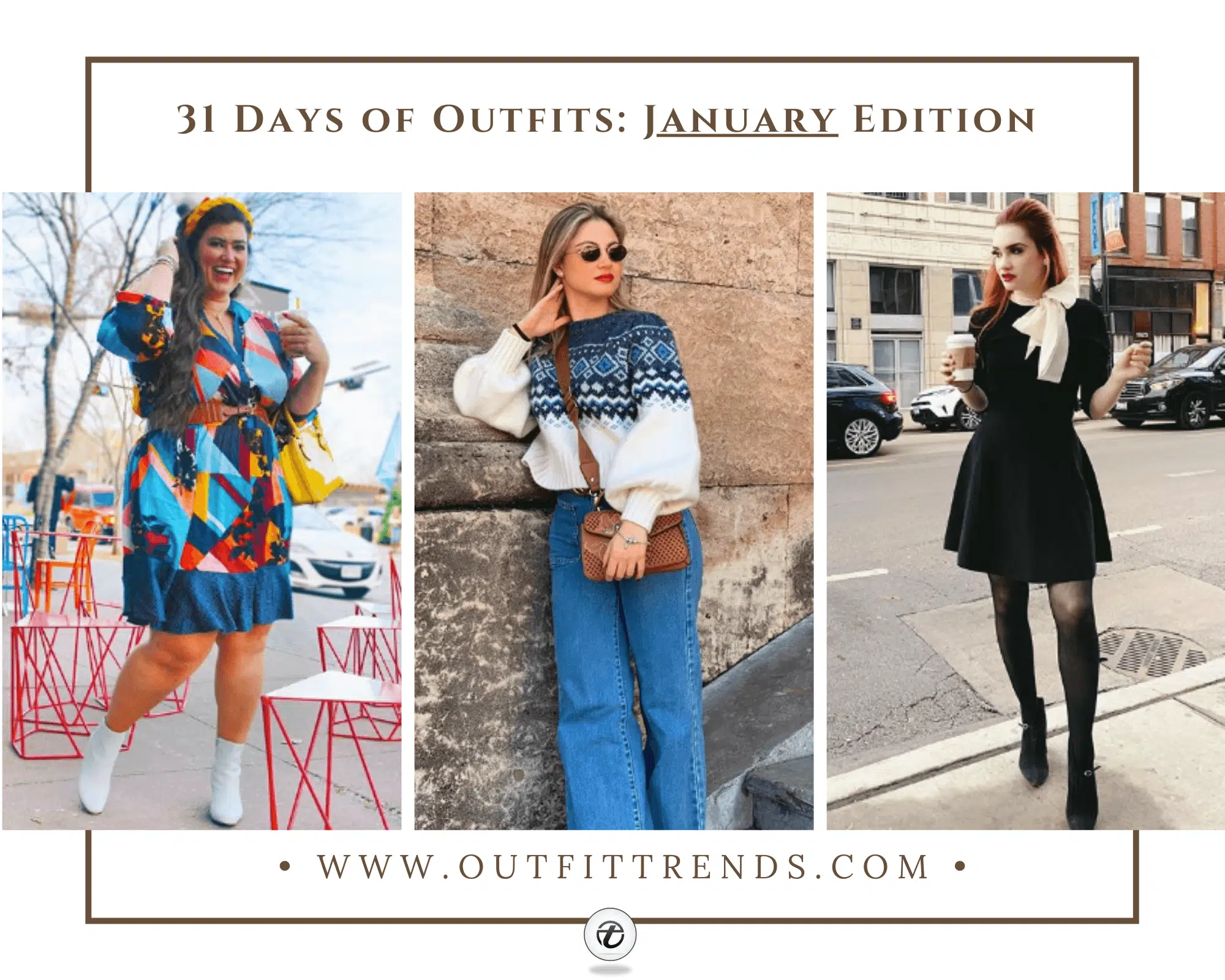
30 Best January Outfits for Women with Styling Tips

30 Best December Outfit Ideas For Women with Styling Tips

27 Best Winter Travel Outfit Ideas for Women with Styling Tips

26 Beautiful Yellow Outfits Ideas For Women with Styling Tips
Colour Families That Actually Work
Not every colour translates well to full monochromatic dressing. I’ve learned this through plenty of failed attempts — bright orange head-to-toe looks harsh under most lighting, and pure yellow washes out most skin tones completely.
The most successful monochrome families are navy and denim blues because they offer natural tonal variation from light chambray to deep midnight navy. Neutral browns work beautifully from cream through chocolate because they mirror natural colour progressions. Grey families from dove to charcoal create sophisticated gradients that photograph well and translate across seasons.
Green surprises people as a monochrome option, but sage through forest creates one of the most wearable palettes I own. The key is staying within either warm or cool green undertones — mixing olive with mint creates muddiness rather than cohesion.
Skip attempting monochrome in bright primary colours unless you’re specifically going for a statement look. Red, electric blue, and bright yellow require perfect execution to avoid looking like a uniform or costume.
Monochrome Outfits That Actually Work
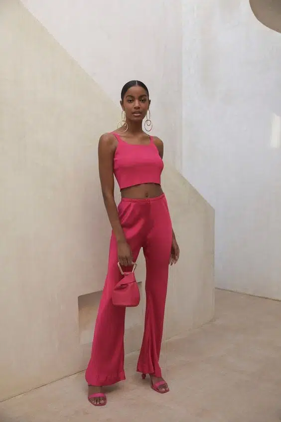
Hot Pink Crop Top and Wide-Leg Set
This vibrant fuchsia two-piece proves that matching sets don’t have to be boring — the cropped tank and flowing wide-leg pants create a sleek silhouette that works because of the contrast in proportions. The matching mini bag ties everything together without looking too coordinated, while the simple gold jewelry lets the bold color do the talking. Perfect for women who want to make a statement but still look put-together for brunch or casual events.
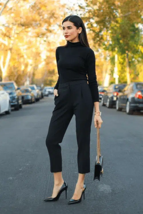
All-Black Turtleneck and Tailored Trousers
This is how you do monochrome without looking like you’re heading to a funeral — the fitted turtleneck tucked into high-waisted cropped trousers creates a clean line that’s both professional and modern. The pointed-toe pumps elongate the legs, while the structured chain bag adds just enough texture to break up all that black. I’ve worn this exact formula to client meetings because it commands respect without trying too hard.
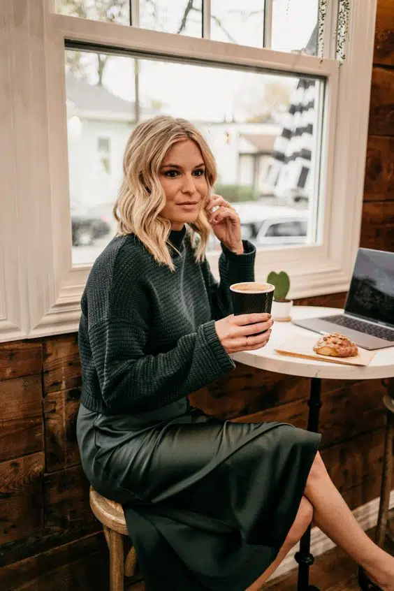
Forest Green Sweater and Midi Skirt
Layering different textures in the same color family is the secret here — the chunky knit sweater against the smooth midi skirt creates visual interest without breaking the monochrome rule. The tonal matching works because both pieces are in the same deep green family, and the midi length keeps it sophisticated rather than overly casual. This combination works beautifully for autumn days when you want warmth with style.
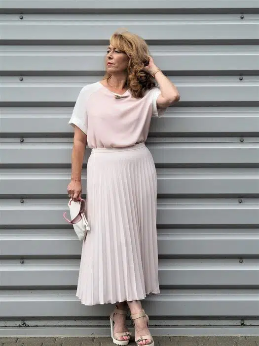
Blush Pink Tee and Pleated Midi Skirt
Soft pink can look juvenile if you get it wrong, but this outfit nails it with grown-up proportions and refined fabrics — the relaxed tee balances the feminine pleated skirt perfectly. The midi length and neutral accessories keep it polished, while the delicate jewelry adds sophistication without competing with the gentle color. I recommend this formula for women over 40 who want to wear pink without looking like they’re trying to recapture their twenties.
Quick tip
Layer different fabric textures in the same color to prevent looking washed out.
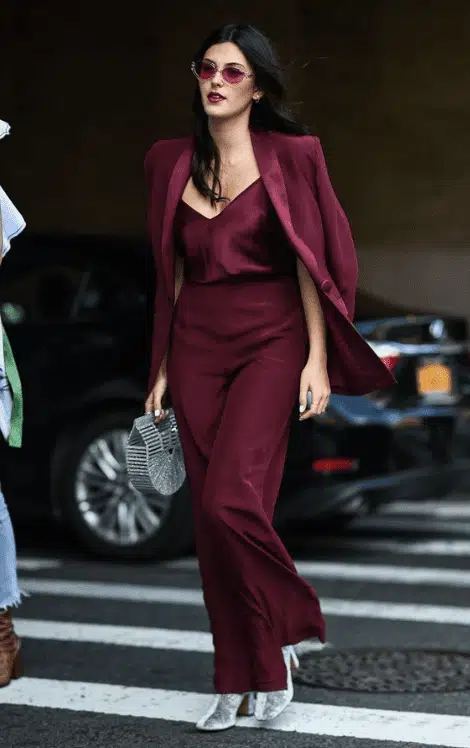
Wine Red Blazer and Matching Slip Dress
This burgundy ensemble shows how to make matching pieces look intentional rather than accidental — the structured blazer worn as a jacket over the fluid slip dress creates a perfect balance of tailoring and femininity. The metallic accessories and ankle-strap heels add just enough contrast to prevent the look from feeling flat. This works for evening events where you want to look polished but not overly formal.
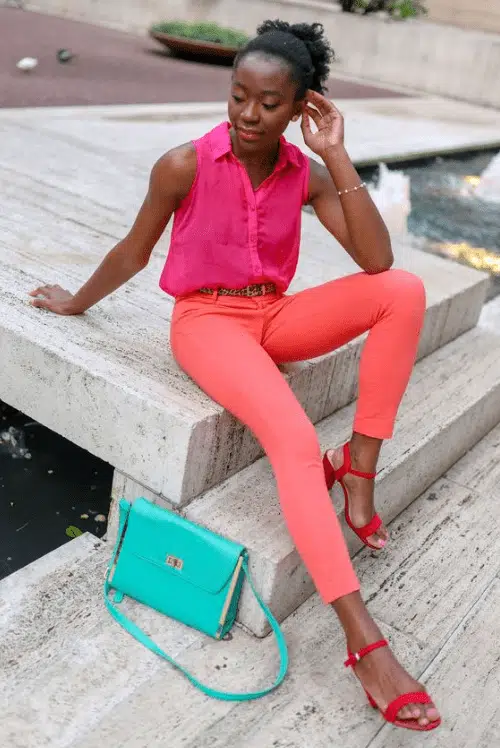
Coral Pink Sleeveless Shirt and Fitted Pants
Color-blocking with different shades of the same family creates depth without breaking the monochrome rule — here, the bright coral shirt against peachy-pink pants proves that you can mix tones within the same color story. The leopard belt adds a playful touch that prevents the look from feeling too matchy, while the turquoise bag provides a pop that makes the whole outfit more interesting. Perfect for women who love color but want to look sophisticated.
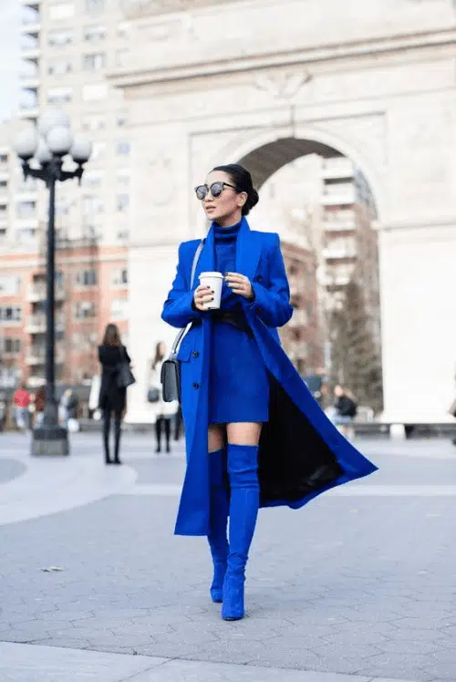
Royal Blue Coat and Turtleneck Mini Dress
This head-to-toe blue look works because it plays with different textures and lengths — the long structured coat over a fitted mini dress creates drama and proportion that’s far more interesting than a simple blue dress alone. The matching over-the-knee boots tie everything together while the sunglasses add an element of mystery. I love this for women who aren’t afraid to make an entrance, though it requires confidence to pull off.
Quick tip
Mix tonal shades of your chosen color rather than exact matches for depth.
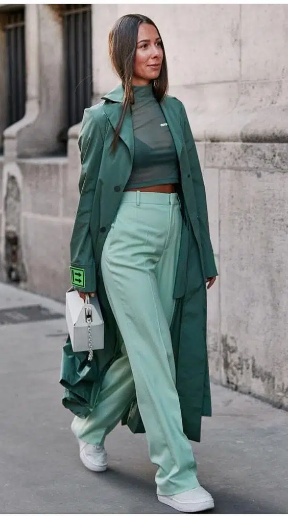
Sage Green Turtleneck with Wide-Leg Trousers
Mixing different shades of green creates a surprisingly wearable monochrome look — the darker forest green turtleneck against lighter sage trousers has enough contrast to define your waist while staying within the same color family. The white sneakers ground the look and make it feel modern rather than matchy, while the structured bag adds polish. This works for casual Fridays or weekend events where you want to look put-together but not overdressed.
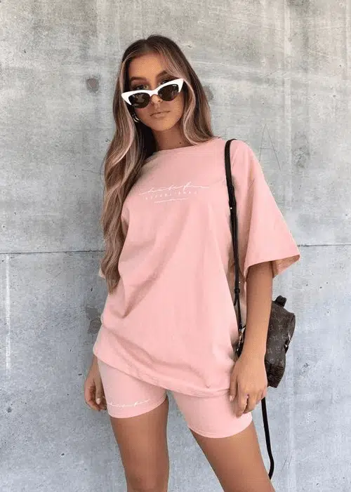
Dusty Pink Oversized Tee and Biker Shorts Set
The matching sweat set gets a grown-up makeover with clean lines and a muted pink shade that’s far more sophisticated than typical athletic wear. The oversized tee tucked slightly into high-waisted shorts creates shape, while the crossbody bag and sunglasses make it street-ready rather than gym-bound. Perfect for running errands or casual coffee dates when you want comfort without looking sloppy.
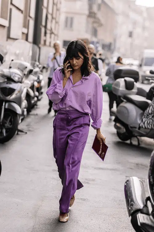
Lavender Button-Down and Straight-Leg Trousers
This purple monochrome look succeeds because it uses two different shades that complement rather than compete — the lighter lavender shirt against deeper purple pants creates enough contrast to define your silhouette. The relaxed fit and classic button-down styling keep it from looking too costume-like, while the simple accessories let the color combination shine. Great for women who want to experiment with color but prefer understated elegance.
Quick tip
Add one interesting neckline or silhouette detail to keep monochrome from looking boring.
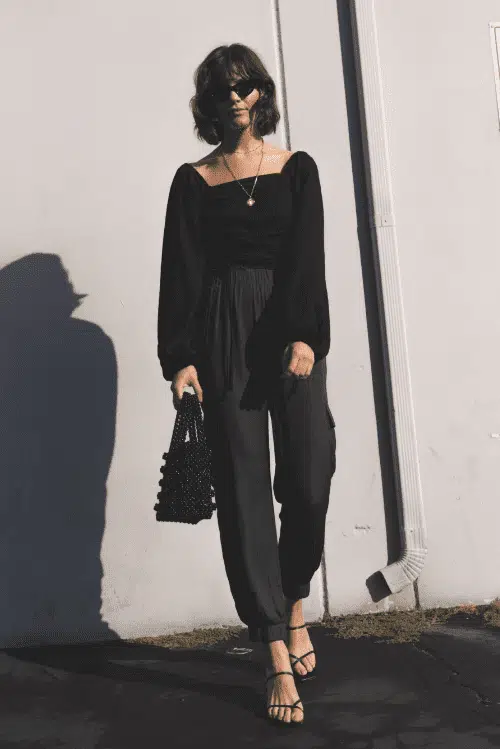
All-Black Off-Shoulder with Wide-Leg Pants
This dramatic monochrome look pairs a square-neck off-shoulder top with flowing wide-leg trousers, finished with strappy heels and a textured handbag. The off-shoulder neckline creates visual interest in an otherwise simple palette, while the wide-leg silhouette adds movement and sophistication. Perfect for evening events when you want to make a statement without relying on color.
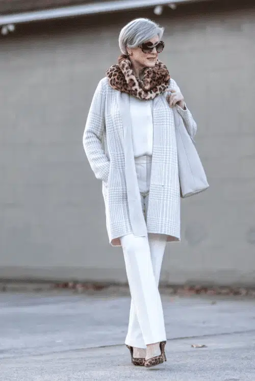
Textured White Winter Layers
Layered white pieces create depth through different textures — a chunky knit cardigan over fitted basics, topped with a leopard scarf for subtle contrast. The varying fabric weights prevent the monochrome look from appearing flat, while the long cardigan creates a streamlined silhouette. This approach works beautifully for transitional weather when you need warmth without sacrificing style.
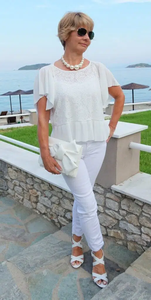
Vacation-Ready White Textures
A lace-detailed flutter-sleeve top paired with crisp white pants demonstrates how texture variation keeps monochrome interesting. The mixed fabric finishes — from delicate lace to structured cotton — add visual depth while maintaining the clean, fresh appeal of head-to-toe white. The pearl necklace and white sandals complete this polished vacation look.
Quick tip
Choose accessories in matching tones to complete your monochrome palette.
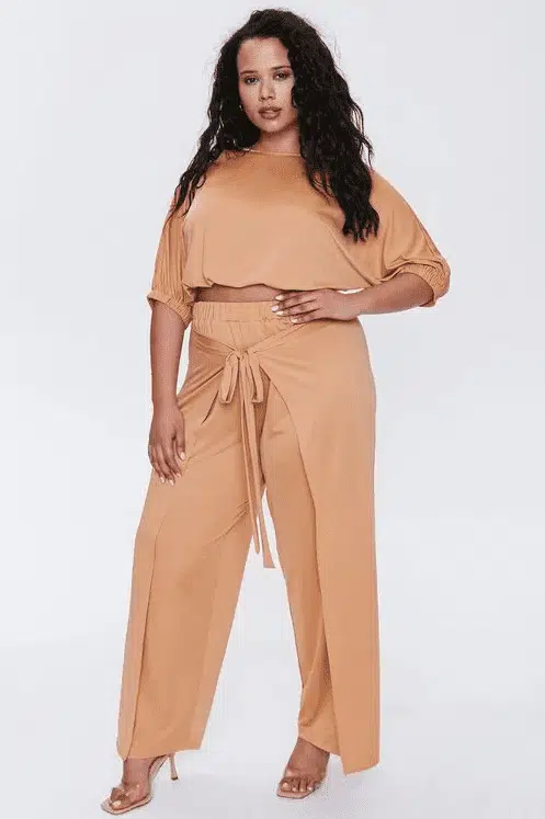
Camel Two-Piece Set
This coordinated camel-toned set proves that monochrome doesn’t have to mean basic colors. The off-shoulder design and wide-leg pants create an effortlessly put-together look that works for both casual and dressed-up occasions. The tonal dressing in this warm neutral is particularly flattering on deeper skin tones and creates an expensive-looking finish.
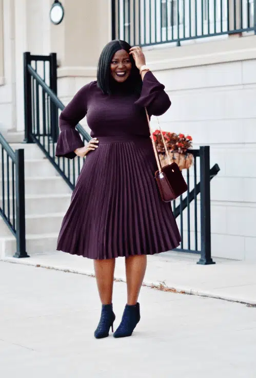
Burgundy Knit Midi Dress
A fitted burgundy sweater dress with pleated skirt showcases how rich colors work beautifully in monochrome dressing. The texture contrast between the smooth bodice and pleated midi skirt adds visual interest, while the deep wine shade feels luxurious and seasonally appropriate. Ankle boots in a matching tone complete the streamlined silhouette.
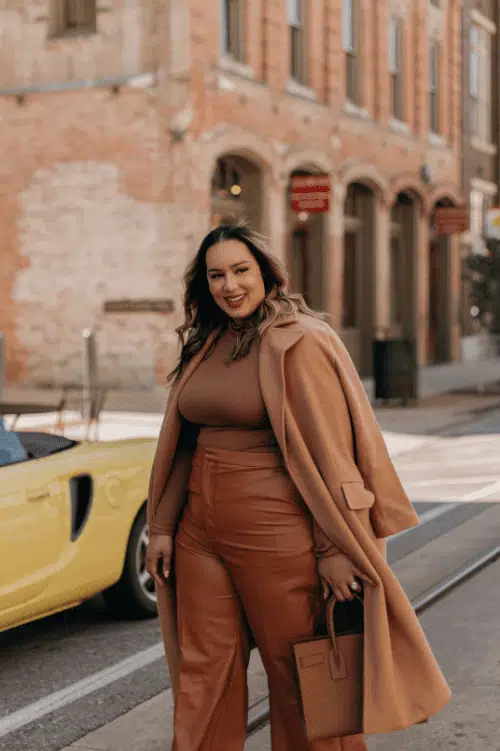
Tonal Brown Leather Coordination
Mixing different shades within the same color family — from chocolate brown to camel — creates a sophisticated monochrome look with depth. The leather textures throughout the outfit add richness, while the long coat provides structure and polish. This approach to monochrome feels modern and expensive without being matchy-matchy.
Quick tip
Try rich colors like burgundy instead of defaulting to black, white, or beige.
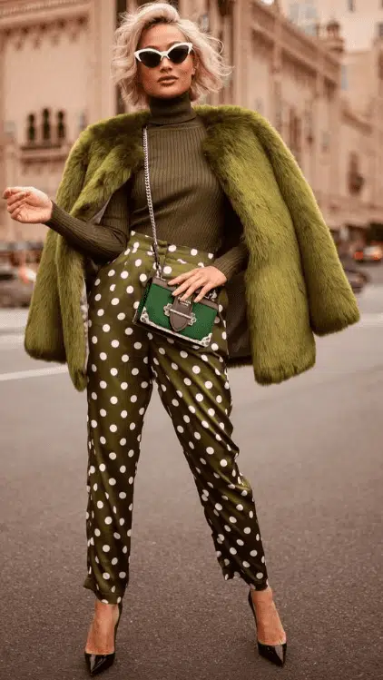
Olive Green Pattern Mix
This bold olive green outfit combines solid and polka-dot pieces in the same color family, proving that monochrome can include patterns. The luxe fur coat elevates the playful polka-dot pants, while the coordinating green handbag ties everything together. This demonstrates how to mix patterns within a monochrome palette for maximum impact.
Key takeaways
- Mix textures within your chosen color to create visual depth and prevent flat-looking outfits
- Try tonal variations of the same color rather than exact matches for a more sophisticated approach
- Use different fabric weights — pair chunky knits with sleek fabrics to add dimension
- Choose one statement element like an off-shoulder neckline or pleated skirt to create interest
- Don’t forget accessories in matching tones — they complete the monochrome effect
- Experiment with rich colors beyond neutrals — burgundy, olive, and camel create striking monochrome looks
35 Best Easter Outfit Ideas for Women & Styling Tips
55 Chic Bohemian Outfit Ideas for Women with Styling Tips
13 Chic Spring Work Outfits For Women With Styling Tips
17 Chic Summer Outfit Ideas for Women with Styling Tips
30 Best January Outfits for Women with Styling Tips
30 Best December Outfit Ideas For Women with Styling Tips
27 Best Winter Travel Outfit Ideas for Women with Styling Tips
26 Beautiful Yellow Outfits Ideas For Women with Styling Tips


