
The moment someone asks what my tattoo means, I know they’ve never considered getting one themselves. Because if they had, they’d understand that sometimes the most powerful tattoos are the ones that need no explanation at all. One word tattoos aren’t about impressing strangers with elaborate artwork — they’re about carrying something so personally significant that you only need a single word to remember it.
Styling Tips
Font choice changes everything — the same word in serif, script, or block letters creates completely different energy. Your font is part of the meaning.
Placement affects visibility and intimacy — wrist words are public, ribcage words are personal. Choose based on how much you want to share. For a more elaborate design around your word, consider pairing with meaningful imagery — see angel tattoo ideas for designs that complement text beautifully.
Consider multiple connected words — some of the most powerful “one word” pieces are actually paired words on each wrist. For inspiration on combining symbols with words, owl tattoos show how imagery enhances a single concept.
The most commonly tattooed word globally is “love” — followed closely by “strength,” “faith,” and “hope.” Their universality doesn’t diminish their personal power.
20 One Word Tattoo Ideas
Wrist Words
The inner wrist is the most popular placement for word tattoos — visible to you, glanceable to others. For a matching piece with someone meaningful, mother daughter tattoo ideas often use matching words or phrases as half-and-half designs.
Collarbone Text
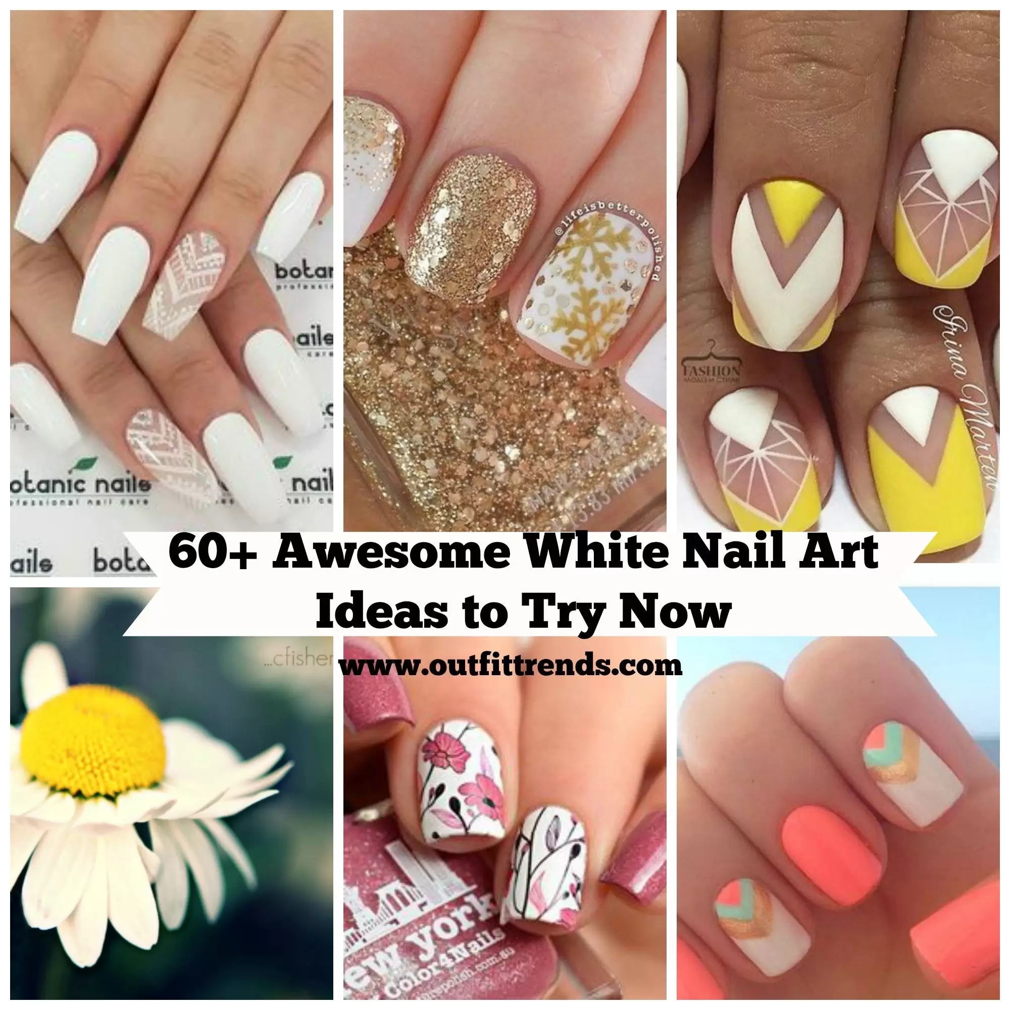
60 Beautiful White Nail Art Designs and Ideas to Try Now
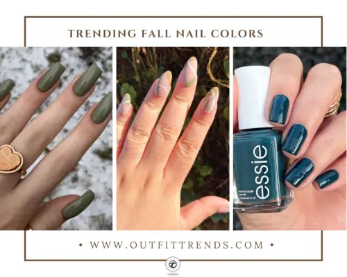
20 Cute Fall Nail Colour Ideas & Designs
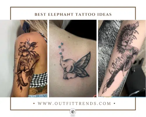
20 Cute Elephant Tattoo Designs with Meaning
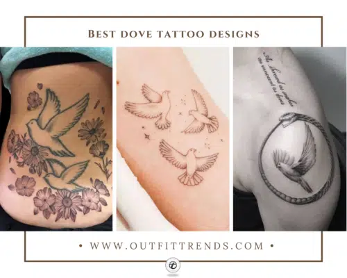
21 Cute Dove Tattoo Designs with Meanings
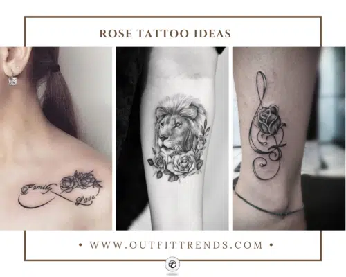
20 Cute Rose Tattoo Ideas with Meanings
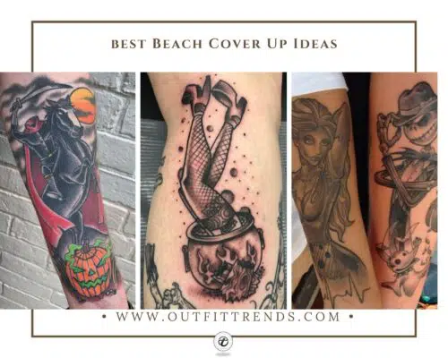
20 Best Halloween Inspired Tattoos Designs
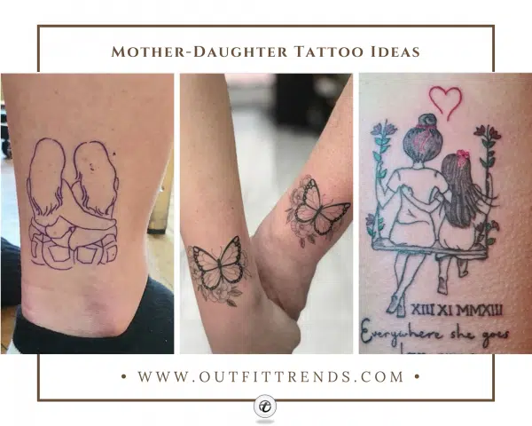
26 Meaningful Mother Daughter Tattoo Ideas
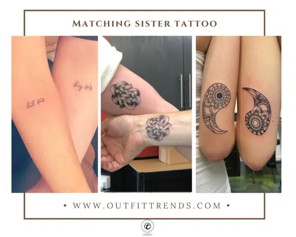
20 Popular Matching Sister Tattoos Designs
Words along the collarbone sit perfectly in formal necklines and are revealed by lower cuts. If you’re unsure about commitment, see how older women approach tattoo decisions — the thoughtfulness that comes with age produces the best tattoos.
Behind-the-Ear
A single word behind the ear — intimate and subtle. Often paired with a small symbol like a star or bird. For symbol inspiration that pairs with words, see angel tattoo ideas.
Key takeaways
- Choose a word that will mean something to you in 20 years, not just today
- For meaningful symbols to pair with your word, see owl tattoo meanings
- For shared words with a loved one, mother daughter tattoo ideas shows matching word placements
- For placement advice across your life stage, tattoos for older women has thoughtful guidance
60 Beautiful White Nail Art Designs and Ideas to Try Now
20 Cute Fall Nail Colour Ideas & Designs
20 Cute Elephant Tattoo Designs with Meaning
21 Cute Dove Tattoo Designs with Meanings
20 Cute Rose Tattoo Ideas with Meanings
20 Best Halloween Inspired Tattoos Designs
26 Meaningful Mother Daughter Tattoo Ideas
20 Popular Matching Sister Tattoos Designs


